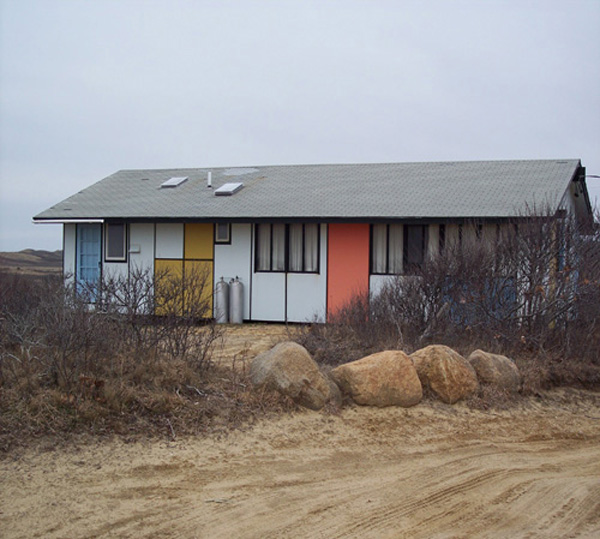
 Does this house fit into its beach bluff surroundings?
Every time I catch a glimpse of this Mondrian-inspired beach house, I ask myself that question. Actually, this small house changed the way I look at beach houses. I held a long-standing notion that a beach house should fold softly into the landscape. A naturally occurring palette of sandy sun-bleached shells and neutral earthy tones would seem to make a beach home recede rather than stand out in its environment. Yet, I am strongly attracted to the symmetry of this colorful beach home, and to the element of surprise.
When I left teaching a few years ago and started on this “reinvention” journey, I thought I would throw myself into design. After enrolling in a Parsons class, my passion was sparked by sustainable design. Living spaces that were environmentally ethical made the most sense to me. This started a creative conversation at Econesting that has hopefully touched a few souls.
I discovered art and design co-mingle in unexpected ways. A small group of architects, designers and artists after the turn of the 20th century established an avant-garde art journal called, De Stijl. The group believed the beauty in painting, sculpture and architecture should create a whole new concept of order. They felt a universal style would symbolize and precipitate collective harmony. The group also believed the search for honesty and beauty would ultimately bring enlightenment to all of humanity. Not sure that happened quite as planned, but I'm all for lofty dreaming.
This group included designer, Piet Mondrian. He created his designs following three basic principles:
1. straight lines intersect at right angles
2. use primary colors: red, yellow, blue, or black
3. composition is an asymmetric balance
You can see these principles applied to the Mondrian beach house above, and the obvious inspiration that influenced Yves St. Laurent's 1965 Vogue cover dress.
So, I’ll ask you…Does this house fit into a beach environment? Want to take a gander at where the Mondrian house is?
Main Credit: Ben Scott

