Food Rule Backlash

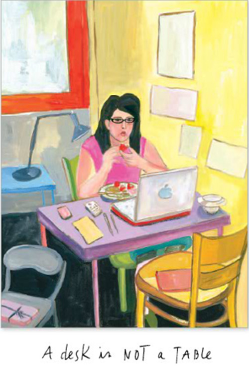
"Do all your eating at a table. No, a desk is not a table.”

Guilty.

Ted says the illustration above is of me. It's not, but it could be.

How many food rules do you break? Michael Pollan has added 19 new rules in his latest book, Food Rules: an eater's manual, and they’ve been brought to life by the fabulous illustrations from artist, Maira Kalman.

I just read an interview with Michael Pollan by writer, Sarah Henry of Civil Eats. The interview digs into how his collaboration with Kalman came to be. When asked during the interview whether or not Pollan feels our interest in the food movement has peaked, he expanded upon why he keeps pushing food:

“I do feel a sense of urgency to keep writing about food. We’re just beginning to see the impact of our food choices on health care and insurance costs—obesity, diabetes, and heart disease are soaring—and we need to keep the pressure on the government and corporations for change.”

I mostly like Pollan’s rules and abide by this one:

“Eat food. Not too much. Mostly plants.”

This rule has been my food mantra for years:

"The fewer the feet, the better the meat”

…minus the feet.

More and more I’m noticing that I have conflicting issues around food--but they're the opposite problem than those who eat too much meat have. For years, my family has chided me to loosen up on my no red meat rule. Friends I’ve known my entire life can’t seem to remember that I haven’t eaten red meat since college. When I'm invited to dinner, they still ask,

“What is it again that you don’t eat?”

Why don’t I eat red meat? I can’t remember. I do know I’ve lost my taste for it. A part of me wishes I could find a reason to bring a little meat back into my diet because I’m getting increasingly paranoid about all the mercury in fish. I'm told, the cute cows I can hear mooing from the farm behind my backyard are the best meat around.

I want to live the life of a locavore. Yet, I can’t eat red meat...and I can’t remember anymore why I hold on tight to that food rule.

Pollan says to those who want to know if they need food rules:

“When you eat real food, you don’t need rules.”

Oh no, this one doesn’t fly with me because I have food rules and I eat real food. Anyone else have this food rule backlash problem?

Food issues are complicated, and the act of eating should be part pleasure, part communion with a hefty dose of healthy nutrition.

Maira Kalman’s illustrations are poignant, funny and sad all at the same time, which just about sums up my latest food feelings. Her art adds a large dollop of cream to Pollan’s book.

http://youtu.be/fugCMaPp0mY

If you’re in mood for a little humor, Pollan brings his food rules to Stephen Colbert’s plate. Watch the funny exchange here.

Main image: Maira Kalman for Food Rules

Excuse Me While I Knit The Sky

I’ve been admiring the sky. The early, check early morning sky…and the late, late afternoon sky. One of the things I love most about living in the Hudson Valley is the color of the mid to late August sky. The morning pinks vibrantly pop on the deep hazy green backdrop. In the early evening, the brilliant blue sky is tinted with an orangey foretelling of fall.

The Hudson River School began capturing this landscape in the mid-1800’s. I recently took a walk on a wonderful local trail, Poet’s Walk. It winds past the Hudson River and is often visited by a line up of artists painting similar depictions of the river, as old masters did so many years before.

Knit The Sky

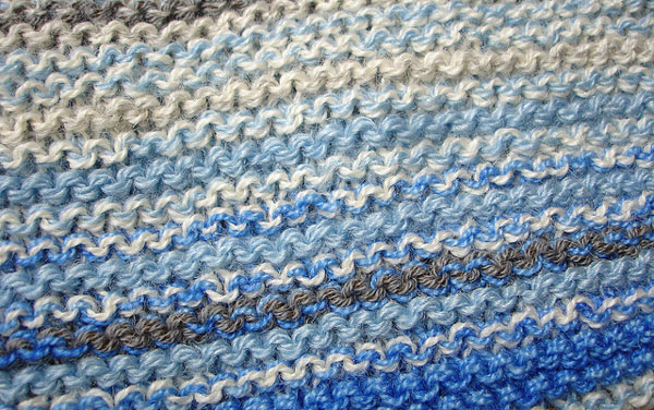
What I did not see on my walk was anyone knitting a Sky Scarf like the one in this video. I love the idea of “concept knitting” - of being inspired to knit by taking a walk or looking out your window. Here’s how the project works:

Sky Scarf from Leafcutter Designs on Vimeo.

Painting: Fredric Church

Sawkille Co.

"That is best which works best…Beauty rests on utility…Simplicity is the embodiment of purity and unity" ~ Shaker Designers

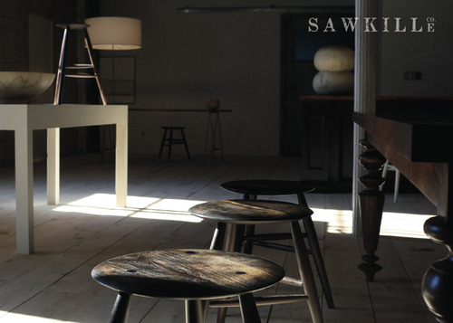
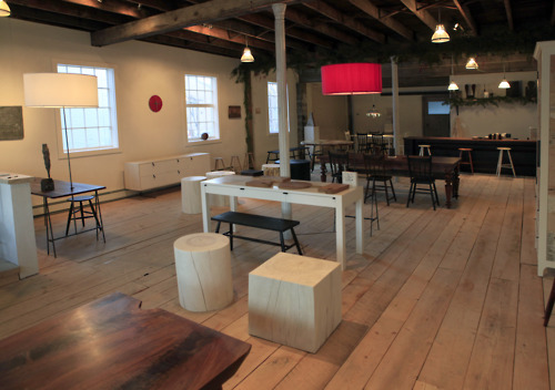
I recently visited the Sawkille Co. showroom for Chronogram magazine and was dazzled by the simplicity of the designs…

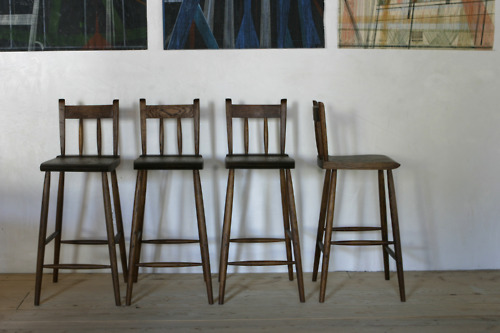
Well-crafted objects enhance the experience of creating a home. The furniture and home décor items of Sawkille Co. are simplistically refined in their celebration of Hudson Valley artisan crafts. The Sawkille showroom in Rhinebeck, purchase NY draws visitors into a comfort zone that comes from an uncluttered space. The warmth of the handmade solid wood furnishings, with their down-to-earth style, conveys an airy and primitive aesthetic. The modern rusticity of the Sawkille’s handcrafted conceptual pieces are beautifully functional, and honestly durable. Large handcrafted wood dining tables created by co-owner Jonah Meyer mingle with hand-forged wall hooks crafted by Tivoli artist John Corcoran. Inspired wall art complements the showroom’s casual and curated displays, giving each piece the breathing space and consideration it deserves.

“We design and build work that will improve with time and use. We hope to add something lovely to an environment that you cultivate, to inspire and nurture yourself or someone you know,” says Jonah Meyer.

Meyer implements traditional wood joinery and finishing techniques with his adept handwork that seamlessly blends the mixed local woods with finely detailed industrial metalwork. His time-honored woodworking skills combine classically formed furniture, creating heirloom quality pieces with an understated elegance. Each table, chair, and storage unit is a functional work of art. Meyer calls this style “Farmhouse Modern.” He explains, “I’m attracted to old, finely crafted American furniture, and I like supermodern. I steal from both disciplines.”

As a RISD-schooled multidimensional artist, Meyer moved to the Catskills where he continued to create art - pottery and sculpture. Along with his wife and business partner, Tara Delisio, Meyer first opened a showroom outside of Woodstock that displayed small-production designs. Delisio, who grew up in Woodstock, runs the website and a delightful accompanying blog that provides a peek into the lifestyle of Sawkille’s inner world.

Some might consider Sawkille Co. a showroom, and others may approach the space as a gallery. But Meyer says, “I’m not in the business of selling art, and this is not a gallery.” While Meyer’s furnishings command center stage at Sawkille, there’s a collaborative artistry at work as well. The careful curation of handmade objects from other fine Hudson Valley artisans blends well with Meyer’s larger hardwood pieces create a cohesive shopping experience.

Drawing from the rich heritage of the Hudson Valley, Sawkille embodies many of the touchstones of sustainable living. All of the wood is local and the furnishings are finished and hand rubbed using beeswax or Danish oil. Low-impact elements give Sawkille a green edge. A local potter is provided sawdust to fuel his firings, and leftover stumps of waste trees are upcycled into gorgeous seats or tables. These zero-waste essentials are the types of monuments to eco-friendly living that make a simple home simply delightful.

Credits: Sawkille Co.

Mondrian Surprise

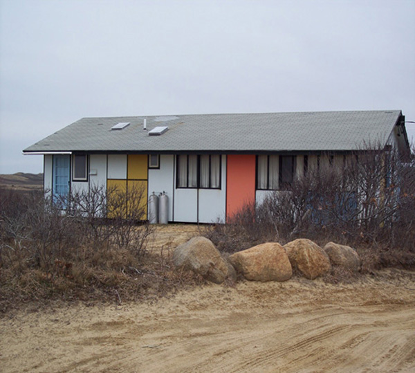
mondrian house Does this house fit into its beach bluff surroundings?

Every time I catch a glimpse of this Mondrian-inspired beach house, I ask myself that question. Actually, this small house changed the way I look at beach houses. I held a long-standing notion that a beach house should fold softly into the landscape. A naturally occurring palette of sandy sun-bleached shells and neutral earthy tones would seem to make a beach home recede rather than stand out in its environment. Yet, I am strongly attracted to the symmetry of this colorful beach home, and to the element of surprise.

When I left teaching a few years ago and started on this “reinvention” journey, I thought I would throw myself into design. After enrolling in a Parsons class, my passion was sparked by sustainable design. Living spaces that were environmentally ethical made the most sense to me. This started a creative conversation at Econesting that has hopefully touched a few souls.

I discovered art and design co-mingle in unexpected ways. A small group of architects, designers and artists after the turn of the 20th century established an avant-garde art journal called, De Stijl. The group believed the beauty in painting, sculpture and architecture should create a whole new concept of order. They felt a universal style would symbolize and precipitate collective harmony. The group also believed the search for honesty and beauty would ultimately bring enlightenment to all of humanity. Not sure that happened quite as planned, but I'm all for lofty dreaming.

This group included designer, Piet Mondrian. He created his designs following three basic principles: 1. straight lines intersect at right angles 2. use primary colors: red, yellow, blue, or black 3. composition is an asymmetric balance

You can see these principles applied to the Mondrian beach house above, and the obvious inspiration that influenced Yves St. Laurent's 1965 Vogue cover dress.

So, I’ll ask you…Does this house fit into a beach environment? Want to take a gander at where the Mondrian house is?

Main Credit: Ben Scott